
Sections:
Scores and Ranks:
On the right-hand panel of your player interface are a series of scores and graphs for overall sustainability and economics, energy and environment sub-scores. For each score category you will see your average score ("Avg Score") and Rank. The scores give an indication of how your farm is doing overall.

Average Score: By default, a player's "Average Score" will always be a percentage of an optimum for the given category. How the score is calculated for each category is described briefly below. You can click on the "Avg Score" to toggle to the current year's score.
Below is a brief description of how scores are calculated for each category.
- Sustainability Score: Combination of your economic, energy and environment scores averaged across all years. Range = 0-100%. By default this is a simple average, but the moderator can adjust how the score is calculated so that some components are weighted more than others.
- Economics Score: Your cash as a percent of player with most money. Click to show total cash ("Capital").
- Energy Score: How much energy your farm is producing as a percent of maximum possible. Click to show score for current year.
- Environment Score: A combination of your farm's water quality, beneficial bugs, emissions and soil health scores. Range = 0-100%. The maximum for each component is 25%. Click to show score for current year.
See the Scoring and Models section for additional detail on how the scores are calculated.
Rank: this give you your overall rank in the score category compared to other players. The rank is always based on your average score for the game. Click in the Scoreboard button to see how you compare to individual players.
Graphs
The graph give more detailed data behind the various scores and allow you to look at longer-term trends in how your whole farm is performing in each category. Depending on the goals and learning objectives of the game, players should spend more time tracking and interpreting different graphs. In each case, the graphs will give you scores and data that represent a total or an average of the scores and data for all of your fields. The basic information for interpreting sustainability, economics, energy and environment graphs is described below.
Sustainability
The sustainability bar graph allows you to track how your overall sustainability score is changing from year to year. The score range is 0-100% and is made up three components: environment, economy, and energy.
The relative size of each section of the bar tells you how much each component score (environment, energy or economy) is contributing to your overall score. The goal is to manage your farm so that you have a high overall score that is weighted fairly evenly between environment, energy and economics. The maximum for each score component for a standard game is 1/3 of 100% or 33.33%.
Since the overall goal of the game is achieving sustainability, it is important to pay close attention to this graph and try to connect how different planting and farm management strategies affect this score.

Economics
The economics graphs help you see how much money you are making from each crop from year to year and decide what crops to plant based upon expected prices. In the basic version of the game you will see two graphs: Prices and Revenues. If "Market-driven Prices" are enabled by the moderator, then you will see two additional graphs: Feed Market and Fuel Market. Each graph is explained briefly below.
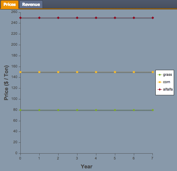
Prices:
An important aspect of overall sustainability is being profitable. Use this graph to track the price of each crop per a ton of biomass and try to plant a mix of crops that will be profitable.
With standard game settings, the prices will be fixed as follows:
- Corn: $150/ton
- Switchgrass: $80/ton
- Alfalfa: $250/ton
However, the game moderator can manually change prices.
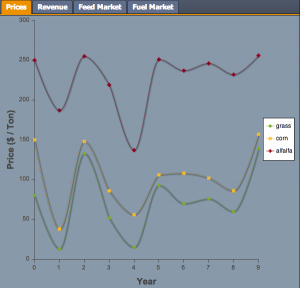
With standard game settings the prices for each crop are fixed unless the game moderator manually changes them (above left). When "Market-driven Prices" are turned on, prices will change from year to year based on supply and demand (above right).
Revenue:
The revenue graph tells you how much money you made from selling each crop year by year. You will see three lines—one for each crop. Revenue = crop price ($) x crop yield (tons). The cost of growing the crops is not accounted for here.
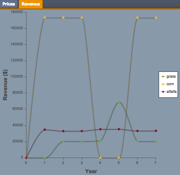
Use the revenue graph to track the profitability of different crops.
Feed & Fuel Markets (optional):
If "Market-Driven Prices" are turned on the moderator, you will see two additional graphs in your Economics panel: Feed Market & Fuel Market.
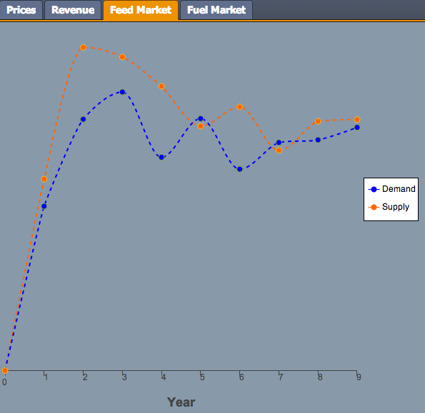
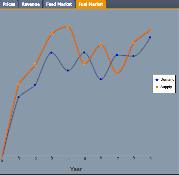
Crop prices are determined by the determined by supply and demand in feed and fuel markets. The supply/demand graphs (above) can be used to illustrate how prices rise when demand is greater than supply and fall when the opposite is true. See Scoring and Models section for details on how the economics model works.
Energy
In the energy tab, you will see graphs showing how much biomass you produced from each crop and how much net energy in ethanol biofuel was produced from each crop. Your energy score depends on how much crop biomass you can grow (yield) and on how efficiently that biomass can be converted into liquid fuel (ethanol in this case). Use your energy graphs to determine how crops compare in their yields and fuel energy production. Adjust your planting and management choices to get the maximum energy over time.
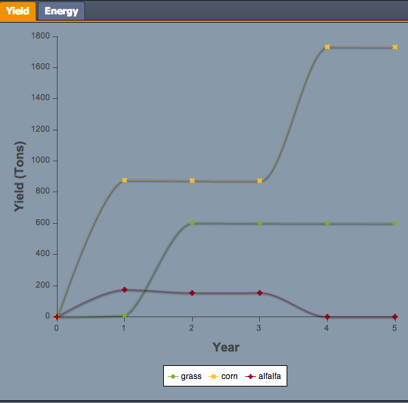
Yield:
The yield graph displays the total amount of biomass harvested for each crop across your farm. The yield will depend on 1) how many fields you plant for each crop and 2) how much biomass you grow and harvest on each field. Therefore, it is important to check your planting history and yield from each field to help interpret trends in this graph. Yield depends on your soil fertility. If, for example, you see yields going down over time, check to see if your soil fertility is falling as well. You might need to change which crops you are planting in some fields and/or adjust your tilling or fertilizer. Note: Switchgrass produces no yield in the first year of planting as it gets established.
Energy:
The energy graph displays how much net energy is produced from the biomass from each crop in the form of liquid fuel (ethanol). View your field-level energy data for more information how the net energy production of each crop, including the energy inputs required to grow and convert the crop to fuel. In some cases, you will see negative net energy numbers. For example, alfalfa has slightly negative net energy because energy is required to grow and harvest the crop, but none is produced from the crop. This is because alfalfa is used for animal feed not fuel. Switchgrass will also produce negative net energy in the first year it is planted because energy is required for planting but no biomass can be harvested until the second year.

Environment
You will see three graphs in your "Environment" tab: 1) Overall Score, 2) Water, and 3) Emissions. Use these graphs to track your farm's overall environmental quality. To get the maximum environment score you want to 1) improve soil fertility by building up soil organic matter 2) improve water quality by reducing nitrate leaching, 3) provide habitat for beneficial bugs that protect your crops from pests and 4) minimize greenhouse gas emissions associated with growing crops.
Overal Score:
The Overall score bar graph allows you to track how your overall environmental score is changing from year to year. The score range is 0-100% and is made up four components: 1) soil health, 2) water quality, 3) beneficial bugs, and 4) greenhouse gas emissions. The relative size of each section of the bar tells you how much each component score is contributing to your overall score. The maximum for each score component on the graph is 1/4 of 100% or 25%. But if you hover your cursor over a bar, you will see a popup displaying the scores on the scale of 0-100% for easier interpretation (see screenshot below).
- Soil Health: an indicator of the amount of soil organic matter in fields. Soil organic matter provides nutrients for crop growth, retains soil moisture and serves as a habitat and energy source for microbes and other organisms living in the soil.
- Beneficial Bugs: indicator of bug biodiversity ranging from 0-100%. This score is affected by both the crop in the field and neighboring fields. Beneficial bugs help protect your crops from pests.
- Greenhouse Gas Emissions (“tons CO2 eq”): how much greenhouse gas is emitted in the process of growing crops and converting them into fuel.
- Water Quality: indicator of quality of water running off the field based upon nitrate leaching from fertilizer and the soil (range 0-100%).
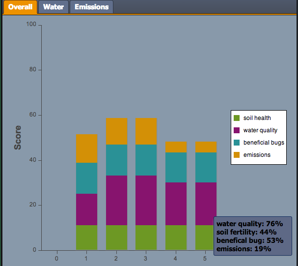
The Overall graph tells you how your environment score is changing from year to year and how the soil, water, bug and emissions components are contributing to the score.
Use the graph to connect planting and management decisions with environmental outcomes. For example, in the graph above, the environmental score decreased after year 3 due to worse emissions and lower water quality. The player would want to look at the field-level information to see what they did did differently in those years to produce these environment effects.
Water:
The Water graph gives a score for your farms water quality compared to the average score for all other players. The score range is 0-100%. The water quality score is an indication of the amount of nitrate leaching from your fields into the groundwater. The higher the score, the better your farm's water quality and the less nitrate is leaching. Nitrate mostly comes from chemical fertilizers and can pollute streams, rivers and drinking water. Use the water graph to help track which crops, fertilizer levels and tillage techniques are improving or harming your farm's water quality.

Water quality is an indication of nitrate leaching into groundwater from your farm fields. Compare you water quality to the average of other players.
Emissions
The emissions graph shows the total emissions of greenhouse gases from growing your crops and converting them into biofuel (ethanol). The goal of producing and using biofuels is to reduce greenhouse gas emissions compared to fossil fuels like gasoline. The greenhouse gases tracked are carbon dioxide (CO2) nitrous oxide (N2O). The unit of measurement is tons of CO2 equivalent or tons CO2e. This unit of measurement allows you to sum emissions of different gases based upon their ability to contribute to global warming. For example, nitrous oxide is 298 times more potent as a greenhouse gas than carbon dioxide so one molecule of N2O is equivalent to 298 molecules of CO2 in terms of global warming potential over 100 years.
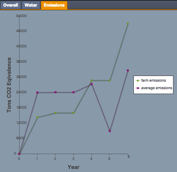
Use the emissions graph to determine what planting and management choices are contributing to more greenhouse gas emissions. Sources of greenhouse gas emissions include running machinery, producing nitrate fertilizers, soil emissions of CO2 (soil respiration) and N2O (fertilizer application). Also included are emissions from transporting biomass to an ethanol refinery and emissions from running the refinery. You can also compare your farms emissions to the average emissions of other players. Read more about emissions in the Scoring and Models section.